I've started work on the 4.0 UI. There are a few big features that depend on the new UI and a large number of smaller improvements that should be possible once it is up and running. I aim to get a prototype version running first, and then we can play with the aesthetics and control details later.
I've just added a Borderless Fullscreen mode, so you can now use every pixel of your monitor for sculpting (It hides the title, menu, borders and windows taskbar)
4.0 UI
-
Simon
- C.E.O.
- Posts: 2576
- Joined: Wed Dec 01, 2004 8:13 am
- Location: Kingston Upon Thames, U.K.
- Contact:
Re: 4.0 UI
Added the menu back in, and now it is functional again. The menu stays open after you make a choice so it is easy to Undo and pick a different option, or pick several options quickly at once.
It is a strange feeling when you disable all the UI elements and just have a pure black screen with your model floating there. I'm so used to the clutter of titlebars and the Windows taskbar it is weird to work without them.
It is a strange feeling when you disable all the UI elements and just have a pure black screen with your model floating there. I'm so used to the clutter of titlebars and the Windows taskbar it is weird to work without them.
-
Dan Silverman
- Posts: 846
- Joined: Wed Dec 10, 2003 5:28 pm
- Location: USA
Re: 4.0 UI
Some people like menus ... some don't. That's why programs like Photoshop have the TAB key hide/unhide the menus. It makes it easy to switch back and forth.
Desktop Workstation
Intel Core i9-10900K 3.7GHz
128 GB RAM
RTX 3090 ti
Windows 11 64-Bit
Intel Core i9-10900K 3.7GHz
128 GB RAM
RTX 3090 ti
Windows 11 64-Bit
Re: 4.0 UI
I like the option to either have the menu open or hidden - depending on the project I'm working. So TAB (or any other shortcut) is a good idea to show/hide UI elements.
-
Simon
- C.E.O.
- Posts: 2576
- Joined: Wed Dec 01, 2004 8:13 am
- Location: Kingston Upon Thames, U.K.
- Contact:
Re: 4.0 UI
TAB in 3.0 hides the panels, in 4.0 it can hide the menu too (if it isn't pinned). And better yet (ala Paintstorm) you can use hotkeys to switch out to different Workspaces where all the settings and panels can be changed together.
I'm just working on the popup/popout (palette) code that lets any menu/panel appear temporarily to be used, and if you want to keep it around or dock it you can just drag it off. There is a lot of potential in this mechanic but it will need lots of experience to fine-tune which panels appear and with what controls.
I need to get the basics working too - scalable icons and fonts will be the foundation for the rest of the UI.
-
Simon
- C.E.O.
- Posts: 2576
- Joined: Wed Dec 01, 2004 8:13 am
- Location: Kingston Upon Thames, U.K.
- Contact:
Re: 4.0 UI
The UI Font can now render at any size. A bit more work will be required to get scalable icons. Ideally I would have an icon for everything - including all the existing menu options and commands - so they can easily be recognised and placed in toolbars or popup menus as icon buttons if needed.
I appreciate that at a small size it will be hard to make distinctive icons for everything - so I might just use examples of the tool's output, and hope they are varied enough to be useful.
I appreciate that at a small size it will be hard to make distinctive icons for everything - so I might just use examples of the tool's output, and hope they are varied enough to be useful.
-
Simon
- C.E.O.
- Posts: 2576
- Joined: Wed Dec 01, 2004 8:13 am
- Location: Kingston Upon Thames, U.K.
- Contact:
Re: 4.0 UI
I've done some tests on the new sizeable icons and it seems 16px is perfect for most icons, and 12px is OK if you know what you are looking for. At the other end, anything up to about 256 px looks fine if you want chunky buttons (Larger than that is works, but you can see the pixels scaling up).
I really like scaling panels, where if you scale down you crush the icons into a small column, but if you scale up you get a medium size icon as well as the full name of the option. Just needs a good bit of Logic to decide how to use the available space.
I also like (but am a bit scared of) a UI that hides everything that is not currently relevant, ie: based on current selection and tool. This means that the UI will constantly be changing - but you will only ever have to scan through relevant options to find the tool/command you need.
-
Simon
- C.E.O.
- Posts: 2576
- Joined: Wed Dec 01, 2004 8:13 am
- Location: Kingston Upon Thames, U.K.
- Contact:
Re: 4.0 UI
Getting the docking behaviour working. It looks more like Curvy 0.9 again with a simple thin toolbar down the side... but this time the icons open popup panels full of useful controls and tools.
I'm thinking about reorganising the menus. It seems odd to have 3-4 ways of JOINING objects in different places based on how it is done. It seems (to me) to make more sense to have a large library of "filters" with a section on "Joining" with all the different options together (Raw Triangle Stitch, Bevelled Boolean, Voxels). This is similar to the way filters are arranged in 2D apps.
Then once you have picked a filter it should helpfully guide you through selecting whatever inputs are required (perhaps autofilling a form with the current group/selection) but letting you pick other things to correct any mistakes (I am now permanently confused over whether to select/group objects and in which order, and which one to pick to make the operation happen!). Perhaps even a hyperlink to a mini tutorial video (overkill?)
-
Simon
- C.E.O.
- Posts: 2576
- Joined: Wed Dec 01, 2004 8:13 am
- Location: Kingston Upon Thames, U.K.
- Contact:
Re: 4.0 UI
I've got sizeable panels, and a basic ps style dark grey look. I'm about to start remaking icons and panels to fit the resizing panels.
-
Simon
- C.E.O.
- Posts: 2576
- Joined: Wed Dec 01, 2004 8:13 am
- Location: Kingston Upon Thames, U.K.
- Contact:
Re: 4.0 UI
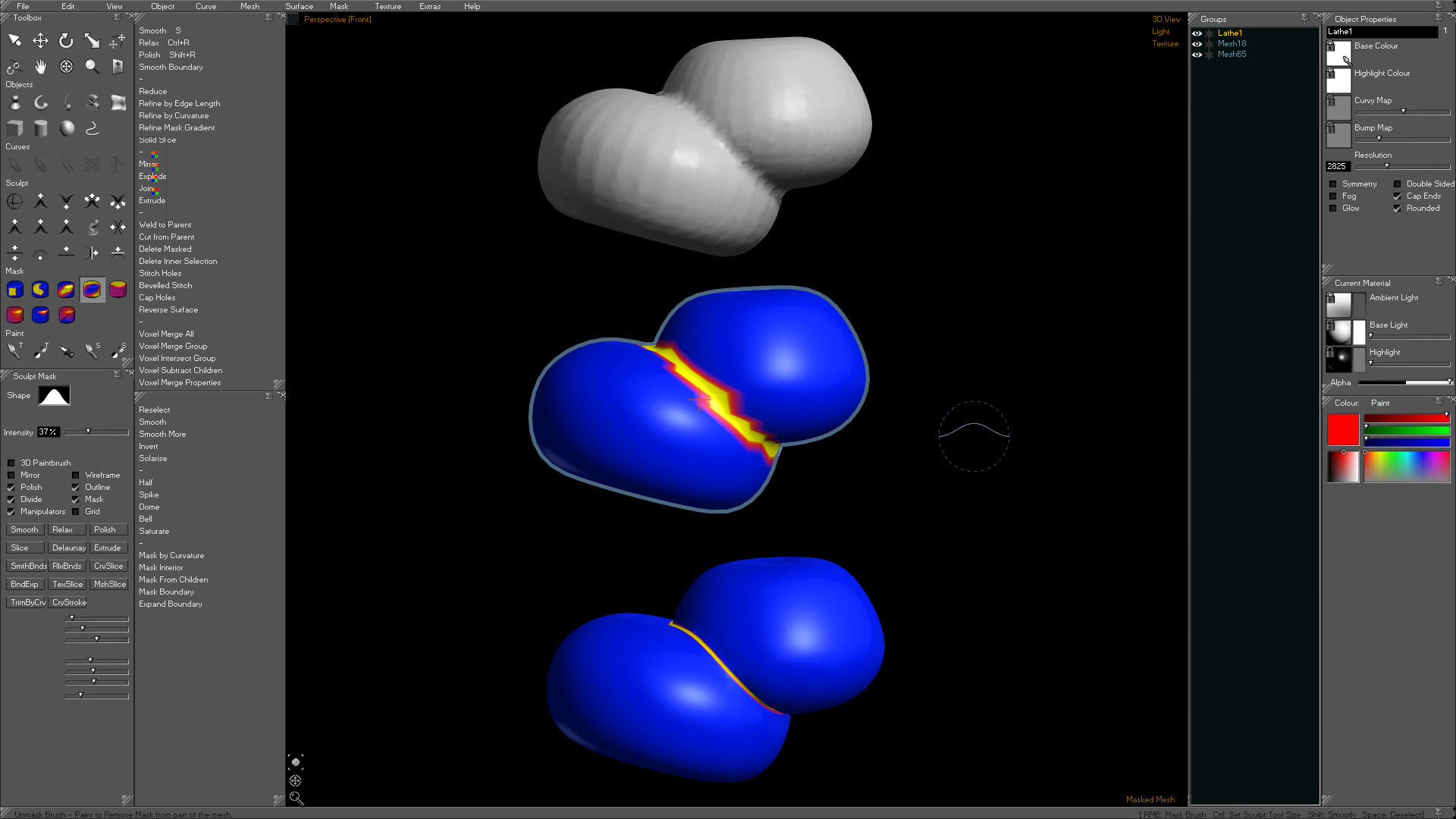
A couple of work-in-progress screens. The fonts go bigger too (90+px fonts if needed) but I haven't resized the panels to fit that yet.
(links as they are full res screens)
http://www.curvy3d.com/images/c4/ui1.jpg
http://www.curvy3d.com/images/c4/ui2.jpg
I really like being able to detach a 'menu' and play around with several actions in a row directly. I imagine the 'menus' will evolve into more compact panels with a mix of icon buttons, controls and commands. Perhaps even with their own accordian style sections to hide away the advanced options until needed.
-
Dan Silverman
- Posts: 846
- Joined: Wed Dec 10, 2003 5:28 pm
- Location: USA
Re: 4.0 UI
Briefly looking at the UI, I would recommend that you look at the Toolbox panel and reconsider how to condense this. For example, you have sections there labeled as Objects, Curve, Sculpt, Mask and Paint. And there is that section up at the top with the select, move, etc., icons. All these could be slimmed down to a small side-bar like the one in Photoshop. In Photoshop you have a brush. If you click it, you activate the brush. But there is a little triangle in at the bottom-right corner that tells the end-user that if you click and hold, you gain access to other brushes (like the Replace Color brush, etc.).
Using an idea like this, you could have a Objects with the Lathe object being shown by default, since it is most likely the most used one. Then the end-user could click-hold on the icon to access any of the other objects via a menu that offers them a selection. And, like Photoshop, once a new item is selected, like the Cube object, then the icon shows the cube by default and it stays the default until the user chooses another object. This is how it works in Photoshop. If I change from the Brush to the Replace Color brush, then the Replace Color brush is always offered to me on that icon until I click-hold and choose another brush.
Doing something like this would really streamline that part of the UI and free up a lot of screen real estate for those that need it. It also makes things look a lot less cluttered.
Another way to handle this, if you don't like "hiding" things in icons like Photoshop does, is to add a strip across the top or bottom of the UI (I prefer the top). When you click an icon, like Objects, you would get options for objects on that top menu strip. This could include a drop down menu to chose what type of object you want to use, as well as other parameters that are just for whatever object they select.
Desktop Workstation
Intel Core i9-10900K 3.7GHz
128 GB RAM
RTX 3090 ti
Windows 11 64-Bit
Intel Core i9-10900K 3.7GHz
128 GB RAM
RTX 3090 ti
Windows 11 64-Bit
-
Simon
- C.E.O.
- Posts: 2576
- Joined: Wed Dec 01, 2004 8:13 am
- Location: Kingston Upon Thames, U.K.
- Contact:
Re: 4.0 UI
I think the old toolbox will become a optional popup "tools browser" with the tools listed in an icon grid, or a a larger format icon+name+preview list. I think this would aim to serve as a tutorial/exploration device alongside the "filter browser".
The new thin toolbar will have the list of main panels you can open (The existing panels, + some new panels to give access to stuff currently only in menus).
It will also have Adobe style icons for top-level tools as you describe, with popups for sub-tool selection (like a menu with icon grid OR icon + name list). Probably filtered by your current selection. I think it would be helpful to include the relevant menu commands in this panel too. Again these could be compact icons, or icon+name. So by selecting a tool, you can also get a context panel for related activities.
And then, perhaps a selection of "curated commands" again based on the current selection.
I'm also thinking of allowing you to drag tool properties/object properties into a thin toolbar at the top or bottom (as well as the bulky spread out version) Reducing it to icons and text input boxes. Could even work as a thin sidebar too. Effectivly letting you make micro versions of the same panel if you like. It remains to be seen which is preferable, an always visible thin toolbar, or a popup larger panel that is usually hidden. Either should work, experience will tell which is the sensible default.
-
Simon
- C.E.O.
- Posts: 2576
- Joined: Wed Dec 01, 2004 8:13 am
- Location: Kingston Upon Thames, U.K.
- Contact:
Re: 4.0 UI
It's like the cliche "I've forgotten more about Curvy than most users ever knew", I'm revisiting all the tools and commands in Curvy and finding so many useful things I'd totally forgotten. Even really obvious stuff like I could pick the Orbit Tool from the toolbox instead of using the in view orbit button or mouse modifier keys. And less obvious but handy "PgUp & PgDown" to navigate between objects in the scene. And I'm only on page 1/13 of the list.
-
Simon
- C.E.O.
- Posts: 2576
- Joined: Wed Dec 01, 2004 8:13 am
- Location: Kingston Upon Thames, U.K.
- Contact:
Re: 4.0 UI
I think a dark UI favors flat light grey icons, while a light UI is better with varied colored icons. I'll try both. It may end up as a skin choice.
The third option is to be a bit more restrictive and use grey + a spot colour. While this looks great, I think it is better to use a full colour palette and sacrifice a little style for readability.
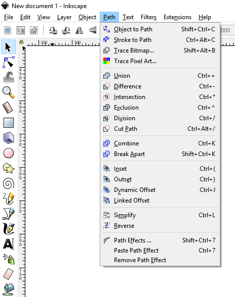
My favorite app at the moment is Inkscape. It uses pastel colours (which I don't like in the Square and Circle icons when they have a gradient to white...) but they do make for a easy to read UI. I like that they manage to have icon for almost every menu command. They give a strong hint as to what the tool name means.
The third option is to be a bit more restrictive and use grey + a spot colour. While this looks great, I think it is better to use a full colour palette and sacrifice a little style for readability.
My favorite app at the moment is Inkscape. It uses pastel colours (which I don't like in the Square and Circle icons when they have a gradient to white...) but they do make for a easy to read UI. I like that they manage to have icon for almost every menu command. They give a strong hint as to what the tool name means.