4.0 UI
-
Dan Silverman
- Posts: 846
- Joined: Wed Dec 10, 2003 5:28 pm
- Location: USA
Re: 4.0 UI
I personally like the monotone icons like you see in Photoshop. Modo's icons, while not being monotone, are pretty nice, too, because they use a fairly restricted color palette which, I think, works well with their dark-grey background. It's all a preference, though, and others have their own. So, offering choices is good. It would be nice to have themes for Curvy. One theme could offer mono icons and another more colorful ones. In fact, if you can open Curvy up to being skinned, then end-users can create themes for Curvy and share them with others.
As far as icons in art programs go, I normally think of this in two ways - 1) icons should be easily recognizable for what they are/do and 2) they should not distract the artist from his work. For me, the monotone icons normally fulfill both of these. They look good, are not distracting, and do the job of conveying what they are/do. Some of the detailed, colored icons can seem (to me) garish and pop out of the UI, demanding attention. They often look (to me) amateurish. Of course, this is all my opinion and others may completely disagree.
As far as icons in art programs go, I normally think of this in two ways - 1) icons should be easily recognizable for what they are/do and 2) they should not distract the artist from his work. For me, the monotone icons normally fulfill both of these. They look good, are not distracting, and do the job of conveying what they are/do. Some of the detailed, colored icons can seem (to me) garish and pop out of the UI, demanding attention. They often look (to me) amateurish. Of course, this is all my opinion and others may completely disagree.
Desktop Workstation
Intel Core i9-10900K 3.7GHz
128 GB RAM
RTX 3090 ti
Windows 11 64-Bit
Intel Core i9-10900K 3.7GHz
128 GB RAM
RTX 3090 ti
Windows 11 64-Bit
Re: 4.0 UI
I prefer to give the user the choice. Different color themes to be combined with different icon sets (gray, color, hybrid).
-
Simon
- C.E.O.
- Posts: 2699
- Joined: Wed Dec 01, 2004 8:13 am
- Location: Kingston Upon Thames, U.K.
- Contact:
Re: 4.0 UI
I'm now at the stage where the whole UI is entirely dismantled and spread out over the workshop floor, and am just starting to put it back together again with the new design features.
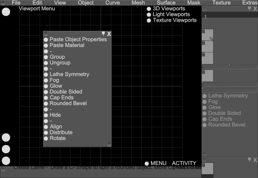
I just found a basic "Context Sensitive Menu" hidden in the lower right of the viewport. Like the "V" menu it has curated commands relevant to the current selection - but it was easily forgotten tucked away there and was barely more useful than the normal menu system.
I just found a basic "Context Sensitive Menu" hidden in the lower right of the viewport. Like the "V" menu it has curated commands relevant to the current selection - but it was easily forgotten tucked away there and was barely more useful than the normal menu system.
-
Simon
- C.E.O.
- Posts: 2699
- Joined: Wed Dec 01, 2004 8:13 am
- Location: Kingston Upon Thames, U.K.
- Contact:
Re: 4.0 UI
I'm planning to depreciate "Record Script" as a tutorial device. I think these days recorded video is more useful, and the new UI will replace the need for scripts to setup your UI layout.
Re: 4.0 UI
Sounds good. Video tutorials are a much better to explain certain tools and such.Simon wrote:I'm planning to depreciate "Record Script" as a tutorial device. I think these days recorded video is more useful, and the new UI will replace the need for scripts to setup your UI layout.
-
Simon
- C.E.O.
- Posts: 2699
- Joined: Wed Dec 01, 2004 8:13 am
- Location: Kingston Upon Thames, U.K.
- Contact:
Re: 4.0 UI
Got it up and running again. Now I've got to fixup 300 or so UI elements to use the new UI, and as many icons for the same as seems reasonable.
There are currently 56 Tools too which will need icons and cursors, although I may simplify that number down - we probably don't need different cursors for each primitive/brush/sculpt tool as the user will be able to check which tool they have elsewhere on the UI (eg: on the toolbar).
There are currently 56 Tools too which will need icons and cursors, although I may simplify that number down - we probably don't need different cursors for each primitive/brush/sculpt tool as the user will be able to check which tool they have elsewhere on the UI (eg: on the toolbar).
-
Simon
- C.E.O.
- Posts: 2699
- Joined: Wed Dec 01, 2004 8:13 am
- Location: Kingston Upon Thames, U.K.
- Contact:
Re: 4.0 UI
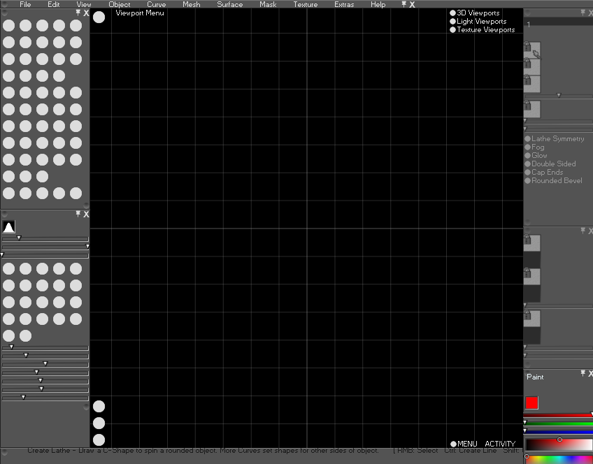
Some WIP shots to show scaling fonts/icons and detachable menus. At this stage it is fully functional (with tooltips) but somewhat confusing without real icons for things! Anyway this is a good launching pad for some of the other UI mods I've got planned and eventually the more interesting stuff hooking in the new functionality.
It's all very flexible now, so any skins/ui ideas should be pretty straight forward to tap into this new framework.
I was reminded today (while looking at cool CosPlay outfits) how much I love character sculpting - so I'm keeping that in mind while I wade through all this GUI work, something to look forward to on the other end


-
granada
- Curvy3D Professional
- Posts: 407
- Joined: Fri Dec 05, 2003 11:43 pm
- Location: brighton,uk
- Contact:
Re: 4.0 UI
This is looking very nice,i love the way your thinking  .
.
Dave
Dave
Windows 10 Pro 64 bit
AORUS B550 Master Motherboard
GeForce RTX™ 2070 GAMING OC 8G
AMD Ryzen 9 5950X 16-Core Processor 3.40 GHz
128 GB DDR4 RAM
3840 x 2160 ,60 Hz
AORUS B550 Master Motherboard
GeForce RTX™ 2070 GAMING OC 8G
AMD Ryzen 9 5950X 16-Core Processor 3.40 GHz
128 GB DDR4 RAM
3840 x 2160 ,60 Hz
-
Simon
- C.E.O.
- Posts: 2699
- Joined: Wed Dec 01, 2004 8:13 am
- Location: Kingston Upon Thames, U.K.
- Contact:
Re: 4.0 UI
A preview of what the new compact toolbar might like with flat icons, alongside a 'all-icon' toolbar. (Red text is for missing icons). Just need to add those little triangles in the corner to hint that the button will popup the full choice of tools.


-
Simon
- C.E.O.
- Posts: 2699
- Joined: Wed Dec 01, 2004 8:13 am
- Location: Kingston Upon Thames, U.K.
- Contact:
Re: 4.0 UI
Reduced toolbox now functional. I can easily further compact some of the tools together if needed (might well compact the sculpting brushes further, they currently take 6 slots).


-
granada
- Curvy3D Professional
- Posts: 407
- Joined: Fri Dec 05, 2003 11:43 pm
- Location: brighton,uk
- Contact:
Re: 4.0 UI
I think this ui will help a lot,its easy to forget what this program can do with a lot of things hidden away  .
.
Dave
Dave
Windows 10 Pro 64 bit
AORUS B550 Master Motherboard
GeForce RTX™ 2070 GAMING OC 8G
AMD Ryzen 9 5950X 16-Core Processor 3.40 GHz
128 GB DDR4 RAM
3840 x 2160 ,60 Hz
AORUS B550 Master Motherboard
GeForce RTX™ 2070 GAMING OC 8G
AMD Ryzen 9 5950X 16-Core Processor 3.40 GHz
128 GB DDR4 RAM
3840 x 2160 ,60 Hz
Re: 4.0 UI
Are the "flat" icons already final, or will you also add some kind of stylized / 3D icons, in the style of the old version of Curvy 3D? Nevertheless I like this concept anyways.
-
Simon
- C.E.O.
- Posts: 2699
- Joined: Wed Dec 01, 2004 8:13 am
- Location: Kingston Upon Thames, U.K.
- Contact:
Re: 4.0 UI
These icons are the simplest I can come up with that let me continue with the rest of the UI development work - very much placeholder and open to new ideas. Happily icons are pretty quick to make and simple to change.
I am expecting to make some shaded/colourful icons eventually (probably made in Curvy!) but that can wait until I have a more complete idea of what is required.
I am expecting to make some shaded/colourful icons eventually (probably made in Curvy!) but that can wait until I have a more complete idea of what is required.
-
Simon
- C.E.O.
- Posts: 2699
- Joined: Wed Dec 01, 2004 8:13 am
- Location: Kingston Upon Thames, U.K.
- Contact:
Re: 4.0 UI
Started a new colour wheel. This scales to any size you like.
Also turned on Antialiasing by default so you don't have to rely on your Graphics Card settings.

Also turned on Antialiasing by default so you don't have to rely on your Graphics Card settings.

Re: 4.0 UI
The new color wheel looks good. Will you also set up a second color field for background color? This way you could easily switch between foreground and background color. Also a small icon would be great, which resets the selected colors to the standard colors. Like there is in Photoshop:

