4.0 UI
Re: 4.0 UI
Very nice progress towards v4.0. Keep on the good work! 
-
Simon
- C.E.O.
- Posts: 2699
- Joined: Wed Dec 01, 2004 8:13 am
- Location: Kingston Upon Thames, U.K.
- Contact:
Re: 4.0 UI
You can now rename objects directly in the groups list (at last!)
-
Simon
- C.E.O.
- Posts: 2699
- Joined: Wed Dec 01, 2004 8:13 am
- Location: Kingston Upon Thames, U.K.
- Contact:
Re: 4.0 UI
I've added normal groups, simple containers for other objects. You can still use the hierarchy to group objects but now you can do:
Instead of having to do this (Which made it hard to move Sphere1 without moving the rest.)
I'm going to experiment with little icons in the groups window to let you know if the item is Mesh/Prim/Curvy/Group.
Code: Select all
-Group
  Sphere 1
  Sphere 2
Sphere 3Code: Select all
-Sphere 1
  Sphere 2
Sphere 3-
Simon
- C.E.O.
- Posts: 2699
- Joined: Wed Dec 01, 2004 8:13 am
- Location: Kingston Upon Thames, U.K.
- Contact:
Re: 4.0 UI
Trying out new groups icons. The square and diamond ones are for DynaMesh and QuadMesh, the rest share their creation tool icons.
Also shows the new "Group" that behaves much like a Folder on a computer.
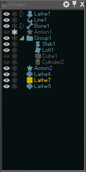
Also shows the new "Group" that behaves much like a Folder on a computer.

-
Simon
- C.E.O.
- Posts: 2699
- Joined: Wed Dec 01, 2004 8:13 am
- Location: Kingston Upon Thames, U.K.
- Contact:
Re: 4.0 UI
I find myself using a few commands and tools a lot, and very rarely needing a more specific tool. I also find I use tools in clusters depending on the stage I am at in my workflow.
The normal solution to this may be to have hotkeys for the very frequent things (Increment & Save, Transform Tools), Toolbars for the usual/recent tools and commands, and Rooms/Workspace Layouts for each stage in the workflow (Curves/Sculpt/Materials+Texturing).
I also want to push towards a simpler interface where possible, perhaps a "Basic Mode" that hides the clutter. But at the same time I want to make the features easy to discover - so you can browse brushes and commands and find useful features and learn exactly how to use them.
Ideally most of that would fall out from having a customisable workspace, but I am interested to see how a dynamic toolbar might work - tracking recent and frequently used tools. I guess this is like keeping a tool out on the desk for a bit in case you want to reuse it before it gets put away again.
-
Simon
- C.E.O.
- Posts: 2699
- Joined: Wed Dec 01, 2004 8:13 am
- Location: Kingston Upon Thames, U.K.
- Contact:
Re: 4.0 UI
After working with the Alpha UI for a few months - adding more features and stress testing the new panel system - I realise I need to spend some time working back towards the "simple & easy" goal while keeping all the extra functionality.
To this end I'm going to revamp the panels with tabbed panels. You'll still be able to move and organise the panels as you wish, but rather than try and stack lots of different functionality in each sidebar - most of the time you'll only have 2 or 3 panels visible, with the rest either hidden, or tidied away on a tab above the currently visible panel.
This should let me actually add more breathing room and neater design to the panels as they won't have to squeeze as small as possible to fit loads on screen.
Also - I'm going to move "one-shot" effects (Like a Filter in PS) to floating/undocked panels, so it is clear that they are in control of the app while they are visible, and will complete/cancel if you click away.
Hopefully this UI work will cumulate in a new Beta at some point!
-
Highlander
- Posts: 4
- Joined: Fri Jul 06, 2018 7:02 pm
Re: 4.0 UI
Dear Simon GOOD WORK!!!
I need the 4.0 NOW!!!! ;o))))))))
Thanks for your effort..
I need the 4.0 NOW!!!! ;o))))))))
Thanks for your effort..
-
Simon
- C.E.O.
- Posts: 2699
- Joined: Wed Dec 01, 2004 8:13 am
- Location: Kingston Upon Thames, U.K.
- Contact:
Re: 4.0 UI
Tabbed, dockable panels are working now. It is refreshing to gain back so much screenspace with things tidy and still easily accessed as Tabs.
I'm also going to go down the standard route of having temporary dialogs simply float over the views while they are being used (no need to dock everything in the sidebars) and using a simple preferences switch to show/hide the menu and status bar - so they don't need to get bogged down in handles and dialog controls.
I'm also working on some new (optional) toolbars for frequently used commands, and I'm expanding the in-view buttons with useful stuff - but these will mostly be hidden along the corners of the view and should only appear when you move the mouse to the corner (It was feeling too cluttered with all the icons there, but the utility is so high I agree they should be available).
You can still 'undock' a dropdown menu from the main menu, great for quickly repeating commands or doing a sequence of commands from a menu... but I'm not letting these panels dock at the sides any more - it is not helpful.
-
Simon
- C.E.O.
- Posts: 2699
- Joined: Wed Dec 01, 2004 8:13 am
- Location: Kingston Upon Thames, U.K.
- Contact:
Re: 4.0 UI
Tabbed panels in action. All of these panels can accept new tabs, but the only panel currently with multiple tabs is the Object Properties in the Top Right - It has Material and Lighting in the other tabs. These will all get little icons in the end. This is actually looking more like 3.0 again!
The bottom row of Toolbox buttons switches the Tools panel beneath it. These represent the main activities you work in during a projects workflow, so I'm hoping you won't need to switch often. As the move/rotate tools are used so often they sit in the main Toolbox.
The layout is fairly flexible - you can for instance shrink the toolbox to a single column of icons, and undock the tool options. And scaling the icons and fonts works too.
Also seen here is a new toolbar - I'm looking at this as a beginner's toolbar as I'd recommend learning the keyboad shortcuts for these frequently used things - you can hide it once you've done with it, or swap out the basic tools for other commands/tools you use frequently.
All the panels/menus/toolbars vanish when you press TAB for a clear viewport.
The other small addition here is the text entry box in Groups - where you can search for objects by name, or multiple objects by prefix. Handy for large scenes.

Re: 4.0 UI
This is looking really awesome.
I can't wait to take it for a test drive!
I also like how the groups/layering is looking
I can't wait to take it for a test drive!
I also like how the groups/layering is looking
-
Simon
- C.E.O.
- Posts: 2699
- Joined: Wed Dec 01, 2004 8:13 am
- Location: Kingston Upon Thames, U.K.
- Contact:
Re: 4.0 UI
Now there is more space I've upgraded the rulers to individual tools, and added a good range of curve editing commands directly to the sidebar. Also started adding icons everywhere.
Also below, the same UI at high and low scales for comparison.


Also below, the same UI at high and low scales for comparison.

Re: 4.0 UI
You should contract yourself out to other companies for icon development.
These are some of the cleanest icons that simply indicate what they do I
have ever seen.
It is such a pet peeve of mine with all these icon heavy programs that
absolutely do not make sense. They may as well be ascii
These are some of the cleanest icons that simply indicate what they do I
have ever seen.
It is such a pet peeve of mine with all these icon heavy programs that
absolutely do not make sense. They may as well be ascii
-
Simon
- C.E.O.
- Posts: 2699
- Joined: Wed Dec 01, 2004 8:13 am
- Location: Kingston Upon Thames, U.K.
- Contact:
Re: 4.0 UI
You can tell I love making icons  So much easier compared to Curvy 1 now I'm using Vector Art (Inkscape) to make them instead of pixel art.
-
Simon
- C.E.O.
- Posts: 2699
- Joined: Wed Dec 01, 2004 8:13 am
- Location: Kingston Upon Thames, U.K.
- Contact:
Re: 4.0 UI
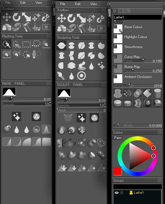
Filling out mesh, mask, and object icons. Some of these are quite abstract concepts!
I added back some direct mesh reduction buttons too, saves on time compared to opening a "Live Action" for example if you want to do a quick voxel merge + reduce.
Tweaked a few sculpt tool icons to make them contrast with each other. Also renamed "Fog" to "Soft Alpha Blending" which seems more on point!
-
Simon
- C.E.O.
- Posts: 2699
- Joined: Wed Dec 01, 2004 8:13 am
- Location: Kingston Upon Thames, U.K.
- Contact:
Re: 4.0 UI
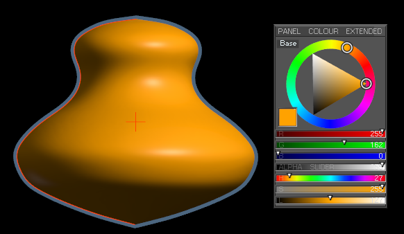
Added an expanded version of the Colour Picker. I going to try using this simple/expanded switch on other panels too to hide the more obscure options and save space in the UI.
This version of the picker is particularly useful for changing saturation at low luminosity - something the triangle&circle control is weak at.

This version of the picker is particularly useful for changing saturation at low luminosity - something the triangle&circle control is weak at.
